Typography
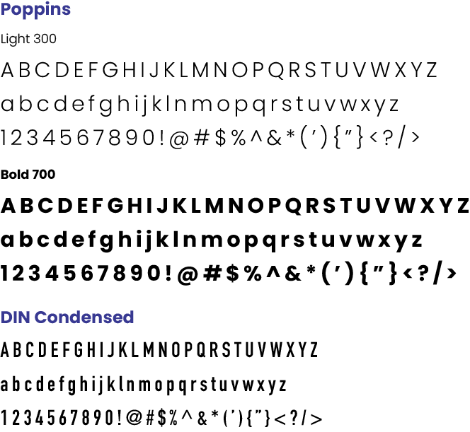
The College’s official fonts are Poppins and DIN Condensed (from Adobe Fonts). Correct and consistent use of these official typefaces reinforces CCP’s identity.

Poppins is the primary typeface for our brand. It is a sans serif typeface with 18 weights that span from Thin to Black. Because of its versatility, it can be used for headlines, subheads, body copy and captions throughout our brand. All weights of this font are permitted.
DIN Condensed should be used as a secondary typeface for complex visual hierarchies where additional interest is needed. Only the Bold weight may be used for secondary headlines, subheads, and infographics. A 10° slant may be applied when emphasis is needed.
